Candlestick charting is a tool that can be used by every investor to better understand market conditions on a daily basis.
Last updated: May 26, 2023
Candlestick charting is a Japanese technique used to analyze price movements. When evaluating the price of a stock over time, there are many way to look at the data (such as line charts and bar charts, for example). Using candlestick charts enables a trader to visualize not only the daily volume and closing price, but also the opening price, high, and low for the day. Additionally, the color of the bars in the chart indicates whether a stock sold off throughout the trading day or gained in price, which cannot be visualized with other typical charting methods.
To read a candlestick chart, you need to understand what data is being displayed on the chart and how it is shown in the parts of each candle.
Candlestick charts display price and volume data:
VolumeVolume is the number of shares that were traded throughout the trading day.
PriceThe price displayed on the chart are the prices that the stock was traded at during market hours.
The stock price changes throughout the trading day due to demand for the stock.
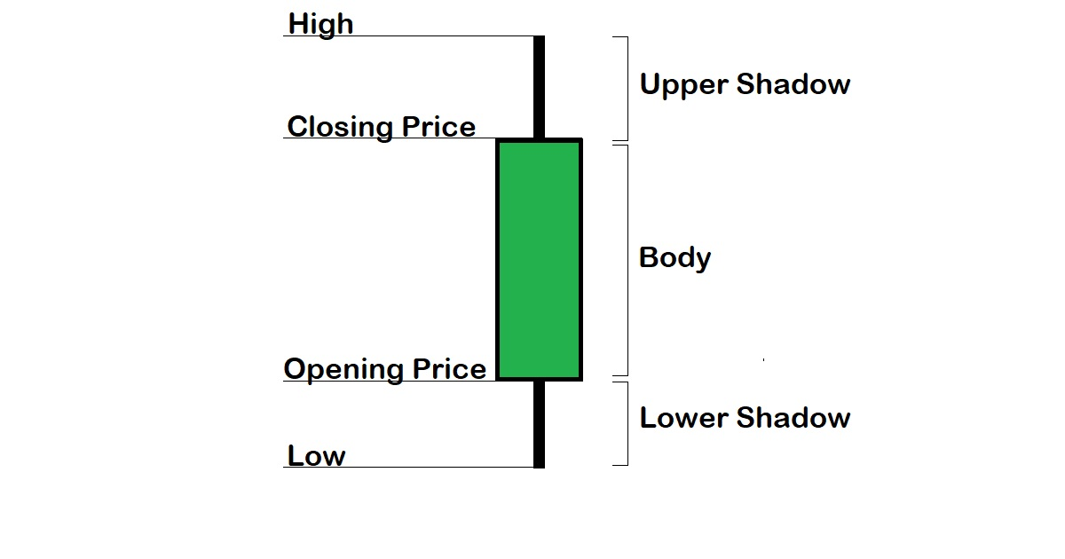
Opening PriceThe opening price is the price that the stock opens trading for the day at.
Closing PriceThe closing price is the price that the stock closes trading for the day at.
Note: when calculating the amount that a stock changed in value over a period of time, these calculations are typically made from closing price on one day to another.
High & LowThe high and low for the day are also important numbers that are shown on the stock chart (these are the highest and lowest prices, respectively, that the stock traded at during the day).
Note: keep in mind that the high and/or low for the day may also correspond to a stock's closing and opening prices.
On a candlestick chart, each day is displayed as a candle, which is a rectangular box of a given color (where the top and bottom align with opening and closing prices) with lines extending above and below it (which correspond with highs and lows for the day):
The body of a candle is the rectangular part of each candle, which shows you where the stock opens and closes for the day.
Sometimes the body of a candle is displayed as a horizontal line, which indicates that the stock opened and closed at essentially the same price.
What are the shadows of a candle?The shadows of a candle are the lines extending vertically above and/or below the candle's body to the stock's daily highs and lows.
Sometimes the stock's daily highs and/or lows correspond to its opening and closing prices. In these cases, lines may not be displayed above and below the candles' body.
Color of the candleFinally, the color of the candle is extremely important as well, as this indicates whether or not the stock sold off for the day (which is typically shown as a red or black candle) or gained in price for the day (typically shown as a green or white candle).
Candlestick patterns are the patterns that are identified with particular candles that are easy to visualize on a candlestick chart.
For example, a doji is a candle where the opening and closing prices are essentially the same for a stock (which results in a candle displayed like a cross).
There are some patterns that have been identified as having the potential to lead to particular market outcomes. For example, they can show you where stocks are struggling to hold new highs (such as the dark cloud cover pattern).
Steve Nison brought Japanese candlestick charting techniques into the Western world through his works and teachings.
Candlestick patterns can be used to help estimate potential support and resistance areas on a stock chart and to identify when trends may be weakening or reversing.
Nowadays, there are lots of tools enable traders to visualize candlestick patterns on trading charts. In addition to the objectivity involved in determining what candles constitute a particular pattern, there is actually a lot of subjectivity involved in making trading decisions and interpreting charts that cannot be explained by one particular candle at a time.
With all of these candlestick patterns so well known, candlestick charting isn't a get-rich-quick scheme but a strategy to help traders better understand what daily fluctuations in price movements might mean. Just because candles indicating a potential reversal are present doesn't necessarily mean that it will actually happen. However, when trend reversals do happen, there is a good chance that candles indicating a potential reversal were displayed to some extent, so in the end it does pay to keep an eye on what candlestick charts are showing for particular stocks.
To learn more about candlestick charting, a great source is Steve Nison's book, Japanese Candlestick Charting Techniques.
To follow popular stocks' latest market movements, follow our blog "The Candle Observer" which posts short articles about popular stocks and some of their latest market movements to show how candlestick patterns are observed in the market.